
The Art of the Elevated Aesthetic
Every couple dreams of a gorgeous, high-end wedding that looks straight out of a magazine—the kind of event where everything feels polished, intentional, and undeniably luxurious. But here’s the secret that wedding planners and luxury designers won’t always tell you: the perception of luxury isn’t just about spending a lot of money. Instead, it’s about intentionality, quality over quantity, and professional execution.
The good news? You don’t need a six-figure budget to achieve that elevated aesthetic your guests will be talking about for years to come. This guide reveals the specific high-impact details—from strategic lighting to perfectly tailored attire—that instantly elevate your wedding’s visual and sensory experience, making it look far more expensive than the actual investment.
Transformative Ambiance: How Lighting and Venue Selection Define Luxury
Strategic Lighting: The #1 Luxury Factor in Wedding Design
If there’s one element that separates an expensive-looking wedding from an ordinary one, it’s lighting. Professional event designers know that manipulating light is the fastest way to create an elevated atmosphere, and the good news is that it’s often more affordable than you’d expect.
The Power of Soft, Warm Illumination
Harsh overhead lights are the enemy of luxury. Instead, focus on soft, warm wash lighting that flatters both your guests and your space. Warm white LED lights create intimacy and romance, instantly elevating the entire ambiance. Candlelight is the ultimate luxury marker—aim for hundreds of candles (real or high-quality flameless alternatives) scattered throughout your venue. The flickering glow creates depth, warmth, and an undeniably upscale atmosphere.
Layered Lighting Techniques
Consider adding bistro lights strung overhead, vintage-style chandeliers, or uplighting on walls to define different areas of your space. These elements work together to create visual interest and prevent the flat, uninspired look of standard event lighting. When guests enter a room filled with layered, warm lighting, their first impression is automatically one of sophistication and expense.

Venue Selection and Strategic Flow
Your venue is the foundation of your wedding’s aesthetic. Choosing a location with inherent character—whether that’s a historic building, modern architecture, or stunning natural views—instantly creates a luxury feel without requiring extensive (and expensive) decoration.
Maximizing Your Space
A truly expensive-looking wedding feels effortless and well-organized. This means ensuring seamless flow between your ceremony, cocktail hour, and reception with no awkward waiting periods where guests feel lost or bored. When guests can easily navigate your event and transitions happen smoothly, it feels professionally orchestrated and refined.
Strategic Draping and Design
Use draping strategically to hide unsightly areas, soften industrial spaces, or define different zones within your venue. High-quality fabric draping instantly adds elegance and allows you to control what guests see, creating intentional vignettes rather than showing off an entire raw space.

Elevated Details: Engaging All Five Senses
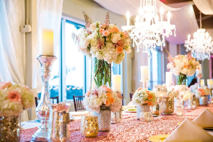
Lush, Intentional Florals: Quality Over Quantity
Expensive weddings rarely feature an explosion of flowers everywhere. Instead, they showcase lush, strategically placed arrangements that make an impact exactly where it matters most.
Strategic Floral Placement
Rather than scattering small centerpieces across every cocktail table, concentrate your floral investment where guests will actually notice: the altar, the bride’s bouquet, the main table, and the bar area. This focused approach creates high-impact visual moments while maintaining a refined aesthetic.
Choosing High-Impact Blooms and Textures
Select flowers with varied textures and statement blooms like garden roses, hydrangeas, and lush greenery. The key to an expensive look is texture and depth, not just quantity. Single-stem arrangements in beautiful vessels on cocktail tables often look more sophisticated than busy, multi-flower centerpieces. Premium florals in unexpected vessels (think sculptural vases or metallic containers) instantly elevate the perceived value.

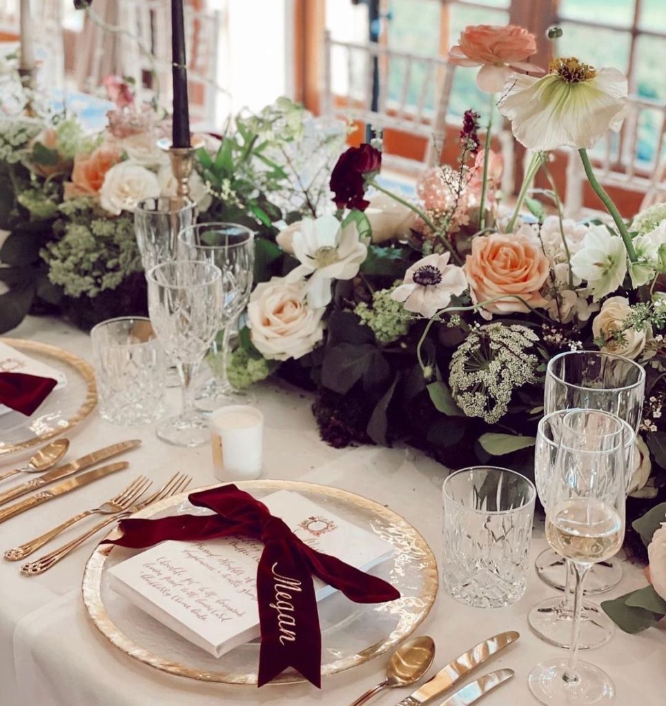
High-Quality Linens and Tableware: The Foundation of Elegance
Your tablescape is one of the most visible elements of your reception, and it’s where smart investment pays immediate dividends.
Upgraded Fabrics Make a Difference
Replace basic white banquet linens with upgraded fabrics in rich textures—velvet, heavy cotton sateen, or linen blends. The weight and quality of your linens immediately communicate luxury. Neutral colors like ivory, blush, or charcoal gray in premium fabrics look far more expensive than bright white poly blends.
Layered Place Settings
Create visual interest and sophistication through layered place settings. Use a charger plate, a main plate, and add a decorative menu card or place card. This seemingly simple detail communicates attention to detail and intentionality—hallmarks of luxury events.
Metallic Accents for Instant Shine
Introduce metallic elements through gold flatware, copper chargers, or brass candleholders. These accents catch light beautifully and instantly add glamour and sophistication to your tablescape. Mixing metallics (gold with copper, for example) creates visual interest without appearing chaotic.
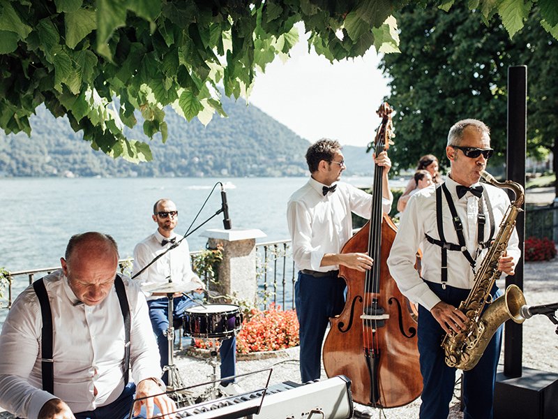
The Soundscape: Creating an Auditory Experience of Luxury
Sound is often overlooked but profoundly impacts the perceived luxury of your event. A well-curated soundscape feels intentional and refined.
The Magic of Live Music
Live music—whether a string quartet during the ceremony or a professional band during the reception—always feels more luxurious than a DJ or playlist. Live musicians add elegance, spontaneity, and a sense of occasion that recorded music simply cannot match.
Controlled Sound and Ambiance
Ensure sound volume is controlled so guests can hold conversations comfortably. A room where you can actually hear your dinner companions feels more upscale than one filled with ear-splitting music. Background music during dinner and cocktail hour should enhance, not dominate, the experience.
Flawless Presentation: Attire, Hair, and Stationery
The Importance of Tailoring: The Secret to Expensive-Looking Clothing
Here’s a truth that will transform how you think about your wedding attire: the single greatest factor determining whether clothing looks expensive or not is fit. A budget wedding dress that’s perfectly tailored will look more luxurious than an expensive gown that doesn’t fit properly.
Investment in Professional Tailoring
Budget for professional alterations for your wedding dress, the groom’s suit, and any other important attire. Work with a skilled tailor who understands the vision for your wedding. Proper tailoring ensures every seam sits perfectly, hems are exact, and the overall silhouette is polished and intentional.
Impeccable Presentation on the Day
Have your attire steamed and pressed the morning of your wedding—wrinkles instantly undermine the luxury aesthetic you’ve worked to create. Whether you’re wearing a gown, suit, or alternative attire, pristine presentation is non-negotiable.

Professional Hair and Makeup: Refined Over Overdone
Luxury weddings feature polished, balanced beauty looks—not overdone or trendy makeup that will look dated in photos.
Hiring Professional Artists
Invest in professional hair and makeup artists who specialize in bridal work and understand how to create looks that photograph beautifully and last throughout your event. A refined, long-lasting look that enhances (rather than dramatically transforms) your natural features is the hallmark of luxury bridal beauty.
High-End Stationery Suite: Paper as a Luxury Statement
Your stationery is often the first tangible experience guests have with your wedding, and premium paper communicates quality immediately.
Quality Paper Stock Matters
Use thick, weighty paper for invitations, menus, place cards, and thank-you notes. Premium cardstock immediately feels luxurious in a guest’s hands. Consider upgrades like letterpress printing, foil accents (gold or rose gold), or handwritten calligraphy for a bespoke, intentional feel. These details suggest a couple who has thoughtfully considered every element of their event.
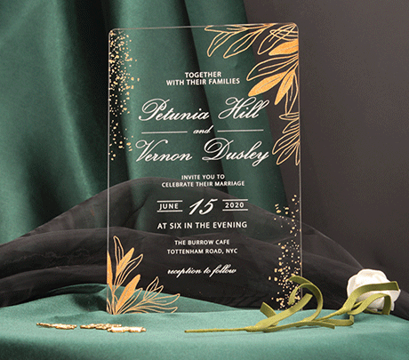
Modern Acrylic Wedding Invitation Suite: Contemporary Luxury
For couples seeking a truly contemporary aesthetic, modern acrylic wedding invitation suites represent the pinnacle of upscale, innovative design. Clear or frosted acrylic cards with elegant typography instantly communicate sophistication and differentiate your wedding from traditional paper invitations.
Why Acrylic Invitations Signal Luxury
Acrylic invitations are undeniably expensive-looking because they’re uncommon, high-quality, and require professional production. Guests immediately perceive them as a premium choice. The weight, transparency, and sleek finish of acrylic create a tactile luxury experience that standard paper simply cannot replicate. Modern couples who choose acrylic are making a bold statement about their design sensibility and willingness to invest in distinctive details.
Design Elements That Maximize the Acrylic Effect
The key to making acrylic invitations look their absolute best is pairing them with refined design elements. Opt for minimalist typography in a modern font (sans-serif options work beautifully on acrylic), gold or rose gold foil printing, or engraved details. Layering clear acrylic cards with coordinating envelopes—perhaps in a luxe paper stock or with metallic linings—creates visual interest and reinforces the premium nature of your stationery suite.
Consider adding a vellum or translucent paper layer beneath the acrylic for a multi-dimensional effect, or pair acrylic invitations with modern wax seals in metallic finishes. These combinations create an Instagram-worthy unboxing experience that guests will photograph and share, extending your wedding’s visual impact before the event even begins.
Cost-Effective Acrylic Alternatives
If full acrylic invitations feel beyond budget, hybrid options offer luxury aesthetics at lower price points. Frosted acrylic place cards paired with premium paper invitations create a high-end mix, or consider acrylic details like table numbers or menu cards to introduce the material without committing your entire suite. Even small acrylic elements positioned strategically throughout your stationery and décor create a cohesive, modern luxury aesthetic.
Seamless Execution: Professionalism and Service
Elevated Service Standards
A high staff-to-guest ratio is one of the most noticeable markers of a luxury event. When service staff is present and attentive, drinks stay topped up, plates are cleared promptly and discreetly, and guests feel genuinely cared for.
Coordinated and Polished Service
Ensure your service staff is coordinated, polite, and uniformed. Professional, attentive service instantly elevates the perceived quality of your entire event. This doesn’t require expensive uniforms—it requires clear expectations, training, and attention to detail.
Thoughtful Guest Experience Details
Luxury events show guests they’ve been considered at every turn. Small touches create big impressions.
Welcome Amenities and Signature Elements
Offer a signature cocktail, welcome beverages during cocktail hour, or small welcome amenities for guests. Provide clear transportation or detailed directions so guests never feel confused or lost. These touches demonstrate intentionality and care, which is the true foundation of luxury hospitality.
Frequently Asked Questions About Creating an Expensive-Looking Wedding
Q: What’s the most important factor in making a wedding look expensive?
A: Lighting is universally recognized as the #1 factor. Strategic use of soft, warm lighting and candles can transform even an ordinary venue into something that feels high-end and romantic. It’s also relatively affordable compared to other luxury elements.
Q: Can I achieve a luxury look on a modest budget?
A: Absolutely. By prioritizing high-impact elements (lighting, strategic floral placement, tailoring, and professional service) and being intentional about where you spend, you can create a wedding that looks far more expensive than your actual budget. Quality over quantity is key.
Q: How important is the venue to the overall luxury aesthetic?
A: Very important. Choosing a venue with inherent character eliminates the need for extensive decoration. Historic buildings, modern architecture, or natural views provide a strong foundation that automatically elevates your aesthetic.
Q: Should I hire a professional wedding planner to achieve a luxury look?
A: While a planner can be helpful, it’s not essential. A wedding looks expensive through intentionality, attention to detail, and professional execution—all of which you can manage yourself with careful planning and by outsourcing key services (photography, catering, florals).
Q: What’s more important: expensive decorations or professional service?
A: Professional service. Guests remember how they were treated far more than they remember specific decorations. A well-staffed, attentive service experience creates a lasting impression of luxury.
Q: How can I make my wedding photos look expensive?
A: Invest in professional photography, ensure impeccable styling and grooming, and focus on beautiful natural light or professionally lit settings. A luxury aesthetic in person will translate to luxury in photos if captured by a skilled photographer.
Q: What are budget-friendly ways to add metallic accents?
A: Look for affordable metallic chargers, flatware, and candleholders at event supply retailers or online marketplaces. Metallic accents don’t need to be heirloom quality to create visual impact.
Q: Is it better to have fewer, higher-quality flowers or more flowers in general?
A: Fewer, strategically placed, high-quality flowers always look more expensive. Overfilled centerpieces feel chaotic and dated, while thoughtfully curated arrangements feel intentional and refined.
Key Takeaways: Invest Where It Shows
Creating a wedding that looks expensive isn’t about having unlimited funds—it’s about understanding what actually communicates luxury and being intentional about where you invest your budget. Focus on the five senses and visual elements that guests will immediately notice: transformative lighting, strategic florals, impeccable fit and tailoring, refined service, and thoughtful details.
A well-planned, intentional wedding will always look more expensive than a poorly executed one, regardless of total cost. The couples who create the most stunning weddings aren’t necessarily those with the biggest budgets—they’re the ones who understand that luxury is about intention, quality, and seamless execution.
Now it’s your turn: What’s your top “luxury detail” investment for your wedding? Are you prioritizing lighting, florals, tailoring, or something else? Share your thoughts in the comments below!
References and Resources
- The Knot. “Wedding Planning Guide: Creating an Upscale Aesthetic.” https://www.theknot.com
- Wedding Wire. “Lighting Ideas for Your Wedding Reception.” https://www.weddingwire.com
- Vogue. “How to Achieve a Luxury Wedding Aesthetic.” https://www.vogue.com
- Martha Stewart Weddings. “The Art of Elegant Table Design.” https://www.marthastewart.com/weddings
- Event Design Institute. “Professional Lighting Standards for Events.” https://www.eventdesigners.org
- The Spruce Weddings. “Wedding Etiquette and Service Standards.” https://www.thespruceweddings.com
You may also interested in:
Pastel Wedding Colors Inspirations for Your Big Day
Wedding Color Palettes: 13 Bold Combos to Make Your Day Unforgettable