
How to Choose the Best Prom Dress Color for Your Skin Tone
Choosing the perfect prom dress colors doesn’t have to be overwhelming. The color wheel is your secret weapon for selecting a shade that complements your natural features and makes you feel confident and radiant.
Beyond Basic Colors: Why the Prom Dress Color Wheel is Your Secret Weapon
The prom dress color wheel takes the guesswork out of color selection by using scientific principles to show which colors work together and which ones will naturally harmonize with your unique features. Instead of randomly choosing based on trends, you’ll make an informed decision that ensures you glow in photos and feel amazing all night.
What You’ll Learn: Mastering Prom Dress Colors for Your Big Night
This guide will teach you how to identify your most flattering prom dress colors based on your skin tone and undertones, understand color harmonies, discover what your color choice communicates, and coordinate your entire prom look using color wheel principles.
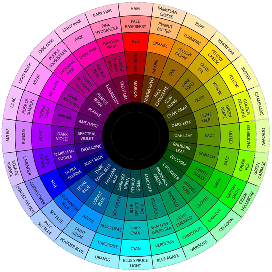
Understanding the Prom Dress Color Wheel: Color Theory Basics
What is the Color Wheel? A Quick Primer for Choosing Prom Dress Colors
The color wheel is a circular diagram showing relationships between colors. It’s divided into warm and cool sections and serves as your roadmap for understanding which prom dress colors work harmoniously together and with your natural features.
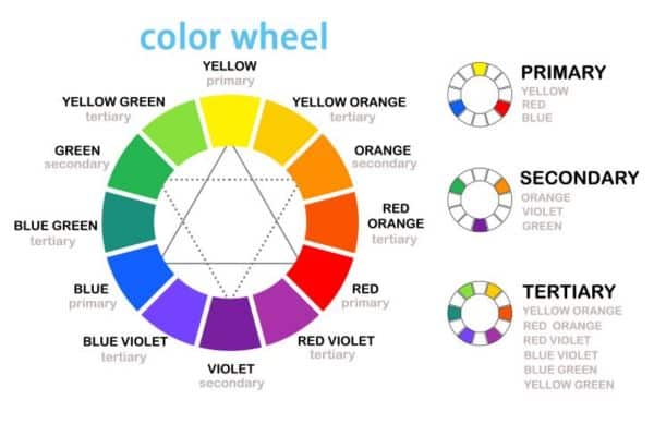
Primary Prom Dress Colors: Red, Yellow, and Blue
Primary colors are the building blocks of all other prom dress colors:
- Red prom dresses: Passion, confidence, and timeless glamour
- Yellow prom dresses: Joy, optimism, and sophistication in deeper shades like gold
- Blue prom dresses: Versatile and universally flattering, from navy to royal blue

Check out: V-neck Red Prom Dress / Blue Corset Draped Prom Gown / Strapless Yellow Column Dress for Prom
Continue to check: How to Match Navy Blue Dress to Prom?
Secondary Prom Dress Colors: Green, Orange, and Purple
Created by mixing primary colors:
- Green prom dresses: From emerald luxury to sage sophistication
- Orange prom dresses: Think coral, peach, and burnt orange for elegant warmth
- Purple prom dresses: Royal elegance from deep eggplant to soft lavender

Chec out: Emerald Green Strappy Prom Gown / Appliqued Orange Prom Ballgown / Purple Halter Backless Prom Dress
Continue to check: Stop Guessing! Choose the Right Green Prom Dress for Your Skin Tone Now
Tertiary Colors: Sophisticated Prom Dress Shades for Stand-out Style
These complex hues (like red-orange, blue-green, or red-violet) offer unique, sophisticated options that help you stand out while maintaining elegance.

Warm VS. Cool Prom Dress Colors: Finding Your Perfect Shade
- Warm prom dress colors (reds, oranges, yellows) energize and create intimacy.
- Cool prom dress colors (blues, greens, purples) are calming and sophisticated. This distinction helps narrow the spectrum to colors most likely to flatter you.
How to Match Prom Dress Colors to Your Skin Tone and Undertones
Identifying Your Skin Tone: Fair, Medium, Olive or Dark Skin
While all skin tones can wear any color, certain prom dress shades are more naturally flattering:
- Prom dress colors for fair skin: Beautiful in pastels and dramatic jewel tones
- Prom dress colors for medium skin: Most versatile, can handle wide color range
- Prom dress colors for olive skin: Stunning in warm colors, metallics, and jewel tones
- Prom dress colors for dark skin: Radiant in vibrant, saturated colors
How to Find Your Skin’s Undertones for Prom Dress Shopping
Your undertones are the key to choosing flattering prom dress colors:
- Warm undertones: Yellow, peach, or golden hints (choose gold jewelry, tan easily)
- Cool undertones: Pink, red, or blue hints (choose silver jewelry, burn easily)
- Neutral undertones: Balanced mix (both gold and silver work well)
Continue to check out: A Simple Guide to Finding Your Skin Undertone
Best Prom Dress Colors for Warm Undertones
Warm undertones: Focus on reds with orange undertones, golden yellows, coral, olive greens, and magenta purples.
Cool undertones: Choose blues, true reds with blue undertones, emerald greens, lavender purples, and cool pinks.
Neutral undertones: You can choose from both sides, focusing on balanced colors.
Metallic Prom Dress Colors: Gold, Silver, and Rose Gold by Undertone
- Gold prom dresses: Perfect for warm undertones
- Silver prom dresses: Stunning on cool undertones
- Rose gold prom dresses: Works well for warm and neutral undertones
- Copper/bronze prom dresses: Excellent for warm undertones
Check out our guide to: Gold, Silver, & Rose Gold: Your Metallic Prom Dress Accessory Cheat Sheet
Prom Dress Color Combinations: Using Color Wheel Harmonies
Complementary Prom Dress Colors for Bold Statements
Colors opposite on the wheel (red/green, blue/orange) create maximum impact. Use one as your dress color and the other as subtle accents in accessories or makeup.
Analogous Prom Dress Color Schemes for Elegant Looks
Colors next to each other on the wheel create naturally coordinated, sophisticated looks. Perfect for creating gradient effects and elegant, pulled-together appearances.
Advanced Prom Dress Color Schemes: Monochromatic, Triadic, and Split-Complementary
Monochromatic: Different shades of the same color create sophisticated depth. Triadic: Three evenly-spaced colors for bold, vibrant looks. Split-complementary: One base color plus two colors adjacent to its complement for balanced contrast.
Prom Dress Color Psychology: What Your Color Choice Says About You
Warm Prom Dress Colors & Their Meaning
- Red prom dresses: Confidence, passion, timeless elegance
- Orange/Coral prom dresses: Warmth, creativity, optimism
- Yellow/Gold prom dresses: Joy, intelligence, luxury
Warm colors suggest approachability, confidence, and energy.
Cool Prom Dress Colors & Their Meaning
- Blue prom dresses: Trustworthiness, elegance, sophistication
- Green prom dresses: Harmony, natural beauty, luxury
- Purple prom dresses: Royalty, creativity, mystery
Cool colors convey elegance, sophistication, and timeless style.
Neutral & Metallic Prom Dress Colors & Their Personality
- Black prom dresses: Ultimate sophistication and timeless chic
- White/Champagne prom dresses: Purity, elegance, classic beauty
- Metallic prom dresses: Luxury, glamour, special occasion elegance
- Neutral tone prom dresses: Understated elegance and refined taste
Choosing a Prom Dress Color That Reflects Your Personality
Consider whether you’re naturally outgoing or prefer quiet elegance, want to make a bold statement or prefer understated sophistication, and what mood you want to create in your photos.
[Check out our guide to: What Does Your Prom Dress Color Really Say About You? ]
Popular Prom Dress Colors: Trending & Timeless Shades for 2026
Classic Prom Dress Colors That Never Go Out of Style
Timeless prom dress colors that remain popular across decades:
- Black prom dresses: Ultimate sophistication and versatility
- Navy blue prom dresses: Classic elegance with visual interest
- Emerald green prom dresses: Richness and surprising universal flattery
- Hot pink/Fuchsia prom dresses: Vibrant sophistication
- Red/Burgundy prom dresses: Timeless elegance with drama
- Royal purple prom dresses: Regal yet approachable
How to Adapt Trending Prom Dress Colors to Your Personal Style
Combine trending elements with personally flattering colors by finding variations that suit your undertones, using trending colors in accessories rather than the dress, or focusing on trending qualities (vibrancy, metallic elements) in your best colors.
[Check out our guide to: Top Prom Dress Trends for 2026 Styles, Colors & Top Designers (Sherri Hill, Jovani) ]
Coordinating Your Complete Prom Look with Your Dress Color
Prom Makeup Tips: Color Wheel Principles for Flawless Coordination
For warm-colored prom dresses: Use golden highlighters, warm eyeshadows, coral blush, and warm-toned lips.
For cool-colored prom dresses: Choose silver highlighters, cool-toned eyeshadows, pink-based blush, and berry or cool pink lips.
For neutral/metallic prom dresses: Match makeup undertones to your skin or complement the dress’s metallic tones.
Use complementary colors subtly: Blue dress with warm bronze eyeshadow, or green dress with subtle red-toned lipstick.
The key is balance—let your dress be the statement while keeping makeup harmonious and authentically you. By applying color wheel principles, you’ll create a sophisticated, cohesive look that photographs beautifully and makes you feel radiant on your special night.
FAQ: Prom Dress Colors and Color Wheel Guide
What prom dress color looks best on me?
The best prom dress color depends on your skin tone and undertones. If you have warm undertones (yellow/golden hints), choose warm colors like red-orange, coral, gold, or olive green. If you have cool undertones (pink/blue hints), opt for cool colors like navy blue, emerald green, lavender, or true red. For neutral undertones, you can wear both warm and cool colors successfully.
How do I determine my undertones for choosing a prom dress color?
To find your undertones, try these simple tests: Look at your wrist veins in natural light (green veins indicate warm undertones, blue/purple veins indicate cool undertones), hold white paper next to your face (yellow cast means warm, pink cast means cool), or consider which jewelry looks better on you (gold suggests warm undertones, silver suggests cool undertones).
What are the most popular prom dress colors?
The most popular and timeless prom dress colors include black, navy blue, emerald green, hot pink, red/burgundy, and royal purple. These classic colors photograph beautifully and flatter a wide range of skin tones. Current trending colors often include metallics like gold and rose gold, as well as jewel tones.
Can I wear any prom dress color with dark skin?
Absolutely! Dark skin looks stunning in vibrant, saturated colors. Jewel tones like emerald green, sapphire blue, and deep purple are particularly flattering. Bright colors, warm metallics like gold and copper, and rich hues like fuchsia, coral, and royal blue all photograph beautifully on dark skin tones.
What prom dress colors should I avoid for fair skin?
There are no colors you must avoid with fair skin, but be mindful of shades that might wash you out. Very pale pastels without contrast can be less flattering. Instead, opt for either soft pastels with vibrant accessories or dramatic jewel tones that create beautiful contrast. Both work wonderfully on fair skin when chosen to complement your undertones.
Should I choose a warm or cool prom dress color?
Choose warm or cool colors based on your undertones, not your personal preference alone. Warm undertones look best in warm colors (reds with orange undertones, golden yellows, coral, warm greens). Cool undertones look best in cool colors (blues, purples with blue undertones, emerald greens, cool pinks). This ensures your dress enhances your natural glow.
What color prom dress is best for olive skin?
Olive skin has greenish undertones and typically looks stunning in warm colors, jewel tones, and metallics. Emerald green, gold, deep purple, warm reds, coral, and bronze are particularly complementary. Rich, saturated colors tend to work better than very pale pastels on olive skin tones.
How do I coordinate my prom makeup with my dress color?
Use color wheel principles for makeup coordination. For warm-colored dresses, choose warm-toned makeup (golden highlighter, warm eyeshadow, coral blush). For cool-colored dresses, use cool-toned makeup (silver highlighter, cool eyeshadow, pink blush). You can also use subtle complementary colors—like warm bronze eyeshadow with a blue dress—to make your features pop.
Are metallic prom dresses flattering?
Metallic prom dresses are very flattering when matched to your undertones. Gold metallics suit warm undertones, silver suits cool undertones, and rose gold works well for warm and neutral undertones. Metallics photograph beautifully and add instant glamour to your prom look.
What’s the difference between skin tone and undertones?
Skin tone is the surface color of your skin (fair, medium, olive, or dark) and can change with sun exposure. Undertones are the subtle hues beneath your skin (warm, cool, or neutral) that remain constant. Both matter when choosing prom dress colors, but undertones are more important for determining which specific shades will be most flattering.