
If you’ve already read our first-timer’s prom guide, you know the drill: buy your dress 6–8 weeks out, well before the theme or decor gets announced. Which leaves a lot of first-time prom goers stuck on one very specific problem — how do you pick a color when you have no idea what the room is going to look like?
It’s a more common situation than it seems. Schools often keep the theme under wraps until close to the date, or announce it so late that early shoppers have already ordered. The good news is that you don’t actually need the theme to choose a color that works. A few smart choices now will hold up no matter what the backdrop turns out to be.
Quick Answer: Safest Colors When You Don’t Know the Theme
If you need a fast answer: jewel tones (emerald, sapphire, wine) and classic neutrals (black, navy, champagne) are the safest bets. They photograph well under almost any lighting, don’t clash with common decor palettes (gold, silver, string lights, floral), and read as intentional rather than accidental — even next to a theme you didn’t plan around.
Colors to be more cautious with: neon brights, pastels that are close-but-not-quite to a “themed” shade, and anything that only works under specific lighting (some metallics can look flat or washed out under stage lighting).
Why Prom Theme-Matching Isn’t as Important as It Feels
It’s worth saying clearly: your dress doesn’t need to match the theme. Most prom photos — the ones you’ll actually keep — are candid shots with friends, not posed against the official step-and-repeat. Decor color schemes matter far less to how your outfit looks than lighting, your own skin tone, and the people standing next to you.
The theme mostly affects a handful of official photo backdrops. It doesn’t affect dinner, the dance floor, the car ride, or 90% of the photos actually taken on the night. Choosing a color you feel great in will outlast any theme mismatch.
[Continue to read: How to Choose the Best Prom Dress Color for Your Skin Tone]
How to Choose a Prom Dress Color Without the Theme
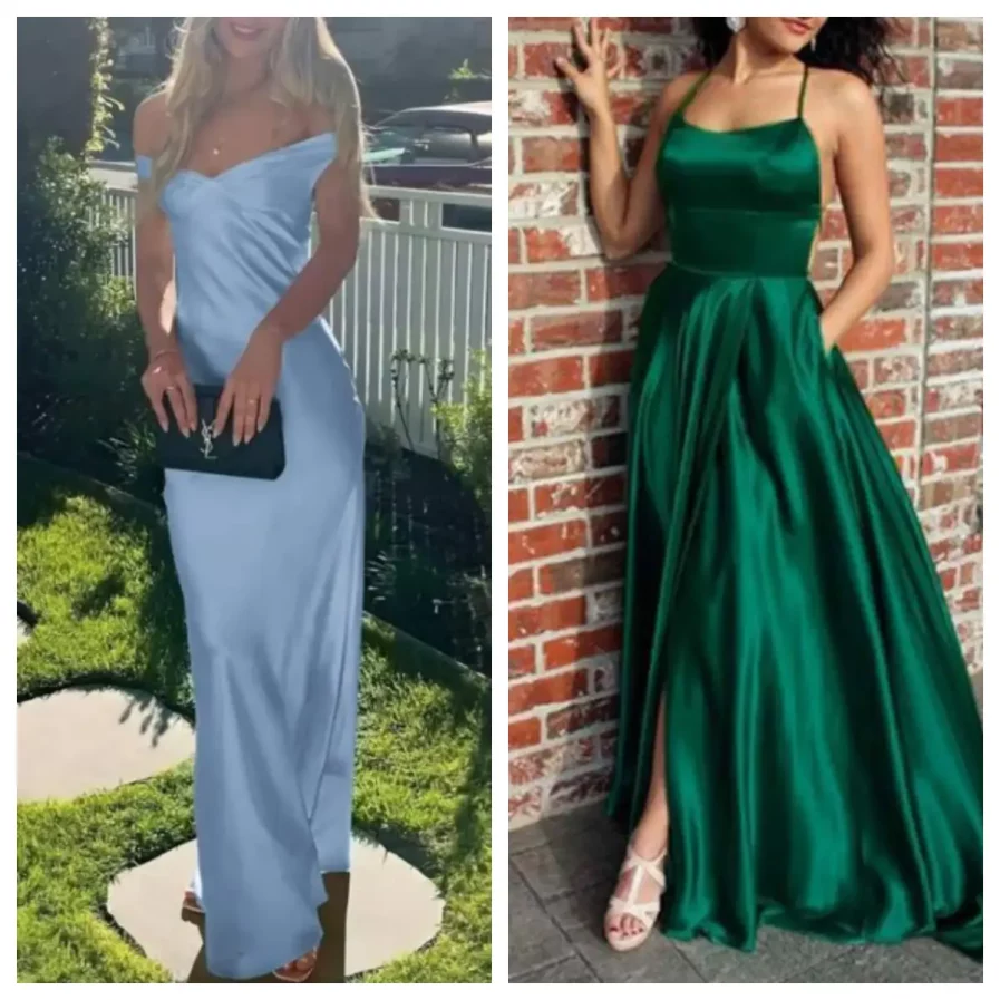
1. Start with what suits your skin tone, not what’s trending
A color that flatters you will look intentional in every photo, themed or not. As a general rule:
- Warm undertones tend to glow in emerald, coral, rust, gold, and warm reds.
- Cool undertones tend to suit sapphire, true red, plum, and icy blues.
- Neutral undertones can generally wear both — jewel tones and deep neutrals are especially safe.
If you’re not sure which category you fall into, holding a few fabric swatches or dresses up against your face in natural light is more reliable than guessing.
2. Lean on jewel tones
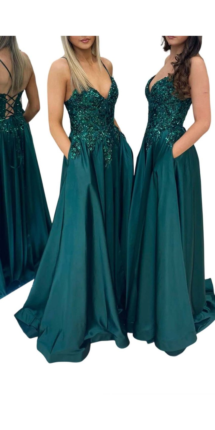
Emerald, sapphire, wine, and amethyst sit in a sweet spot: they’re rich enough to photograph well under both flash and stage lighting, and they complement almost every common decor palette — gold, silver, string lights, floral centerpieces, even black-and-white themes.
[Continue to read: Styling an Emerald Green Prom Dress: The Ultimate Guide (Shoes, Jewelry & Makeup)]

3. Or go classic with neutrals
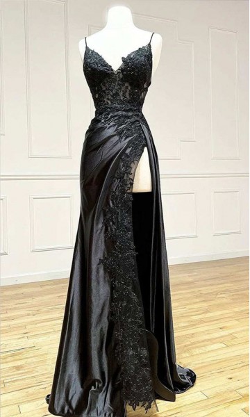
Black, navy, and champagne are the closest thing prom dressing has to a “wildcard” color — they work with literally any theme because they read as elegant rather than coordinated. Black in particular has shifted from “safe but boring” to a genuinely popular choice in recent seasons.
4. Avoid colors that only work in one lighting scenario
Some pastels and metallics look beautiful in daylight or on a screen but wash out flat under venue lighting (school gyms and hotel ballrooms often use warm, low, or colored lighting). If you’re set on a lighter shade, look for photos of the dress under artificial or low light before buying — not just the studio product shot.
5. Check what your friend group is wearing
If you’re going with a group, a quick color check-in avoids the (unlikely, but real) scenario of two people showing up in near-identical shades. You don’t need to coordinate — just avoid direct overlap.
[Continue to check out: What to Do if the Same Dresses Happen on the Prom Party ]
Prom Dress Color Pairings That Work With (Almost) Any Theme
| Your Prom Dress Color | Works Well With Prom Theme | Be Cautious With |
|---|---|---|
| Emerald green | Gold, black, floral, “enchanted garden” themes | Other greens (can clash if too close in shade) |
| Sapphire blue | Silver, white, “starry night” or celestial themes | Warm-toned gold if the shades fight each other |
| Wine / burgundy | Gold, black, “Old Hollywood” themes | Bright pink or red (can look mismatched, not intentional) |
| Black | Any theme, any decor palette | Nothing — this is the safest option overall |
| Champagne / gold | Metallics, “Old Hollywood,” neutral palettes | Very cool-toned blue or silver themes |
| Pastel (blush, lilac) | Soft or garden-style themes, daylight events | Low or warm venue lighting — test before buying |
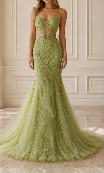
What Color to Wear to Prom Without a Theme FAQ
No. The theme mainly affects official photo backdrops and decor — it doesn’t need to dictate your dress color. Most photos taken on the night are candid, not posed against a themed backdrop.
Jewel tones like emerald, sapphire, and wine, along with classic neutrals like black and navy, work with nearly any decor palette and lighting setup.
Very specific pastels, neon brights, and metallics that only look good under certain lighting are riskier bets, since they can clash with an unexpected theme or wash out under venue lighting.
Yes. Black works with virtually any decor palette and lighting setup, making it one of the lowest-risk choices for anyone buying before the theme is confirmed.
Still deciding on a color? Browse HappyProm’s full prom dress collection, filterable by color, so you can find a shade that works with your skin tone — and pretty much any theme your school throws at you.
